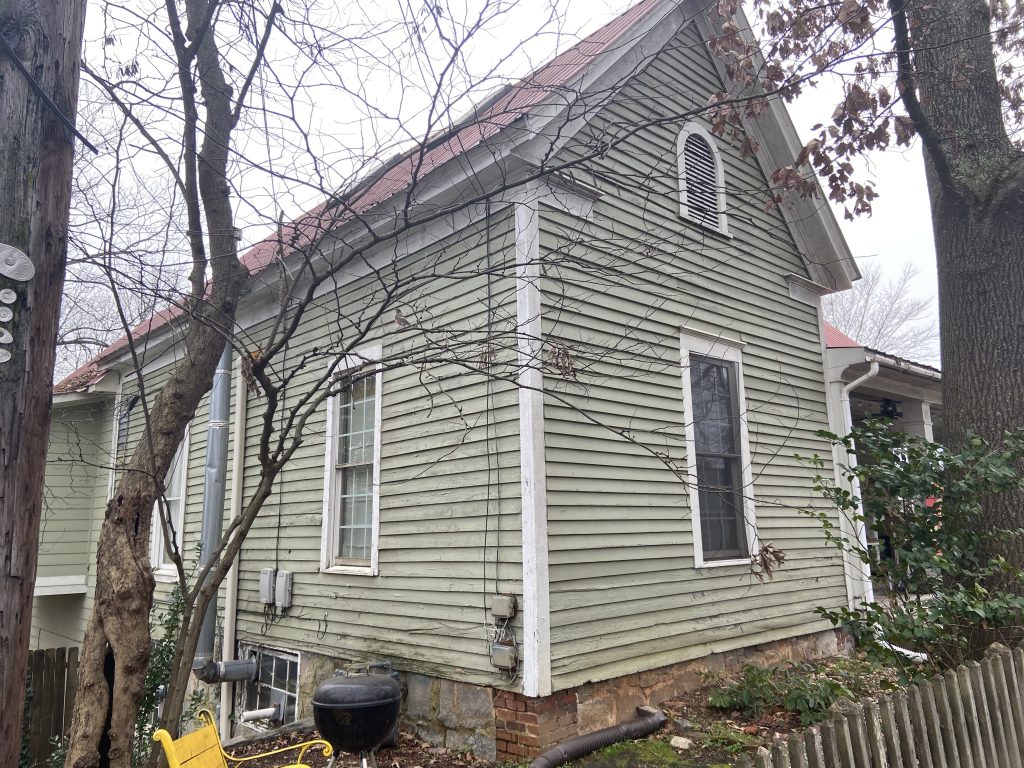
Painting the house has been on the list for a while, but since it’s not something you tackle yourself, it’s easy to put it off. It involves quotes and experts and thousands of dollars. I like my power tools, but when someone asked me if we were going to do it ourselves, I laughed.
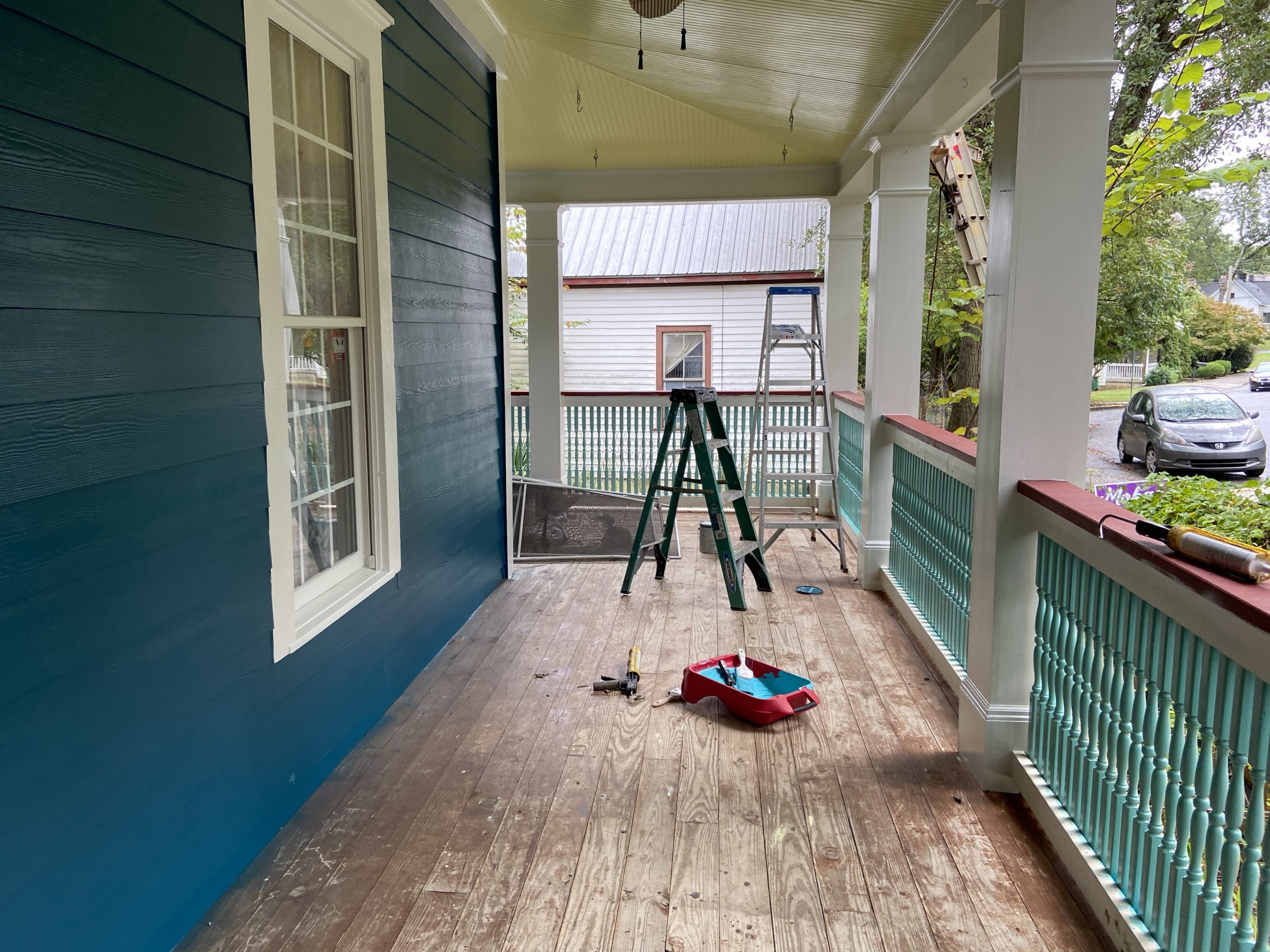
Painting a house is not something you take on lightly. First, there’s preparation—power washing and scraping and, as it turns out, lots of woodwork to replace. At least half our house needed some serious interventions, and I was not the person to tackle it.
But picking the contractor (who fixed our rotted wood and oversaw the painting) was the easiest part. What’s paralyzing with fear is the color. The color is everything: It’s what tells others how smartly you spent your money. It’s the first impression you give others of your house. Once you pick the color, there’s no turning back—so you’d better be ready for a commitment (well, I guess there could be turning back, but it’s an expensive choice to make).
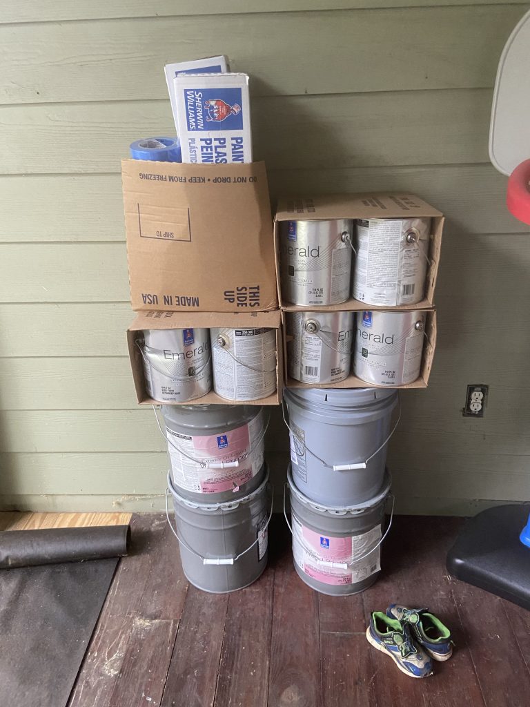
Like I said, it’s a big commitment. This is the paint once it was delivered. It might not seem like a ton of paint, but this is apparently what $1,700 of top-quality paint looks like.
We had to decide on six colors: (1) the body color, (2) the trim, (3) a main accent (4) a secondary accent, (5) the porch ceiling and (6) the porch floor.
Now, we may have had a few more colors to choose because of how our house is. We have a wraparound porch and some Victorian-ish accents that could hold some additional colors. I wanted to go into all this with a plan, though. Here’s what I did.
Step 1: The body
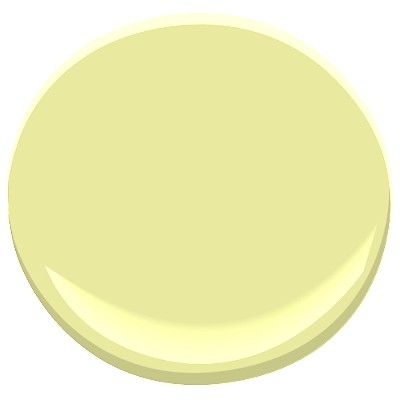
Since we added our attic addition a couple years ago, I’ve been slowly recoloring the rooms below it. This meant switching the warm green, burgundy, peach and yellows in the family room, kitchen and hallway to variants of Benjamin Moore’s Fanfare and White dove, the benchmark colors in our second-floor living spaces. Bottom line, the interior of my house is slowly taking on a cool palette, so I wanted the exterior to reflect that, too.

White Dove Fanfare


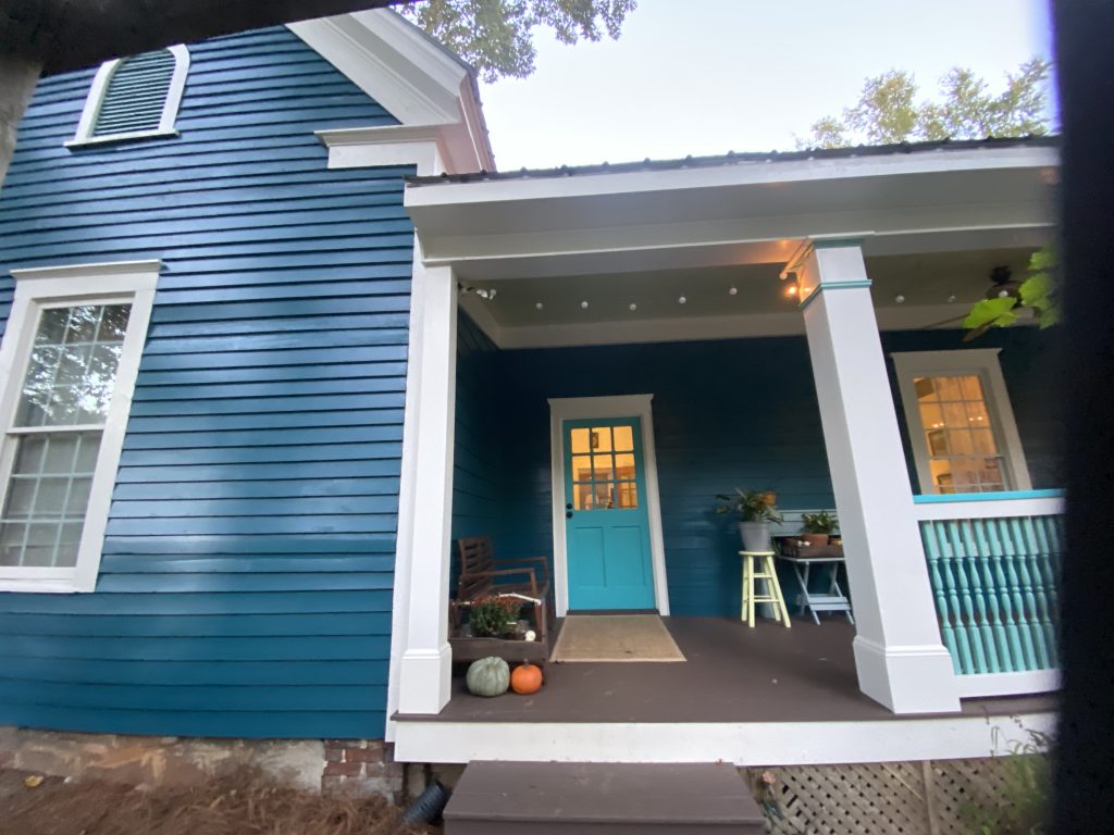
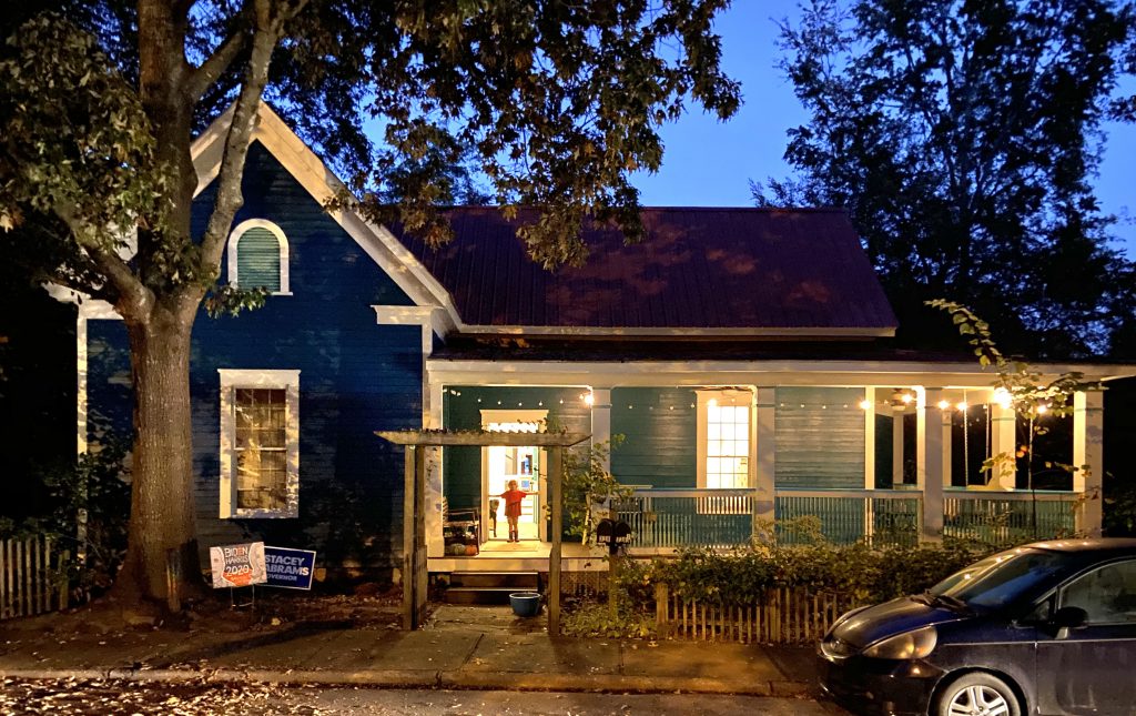
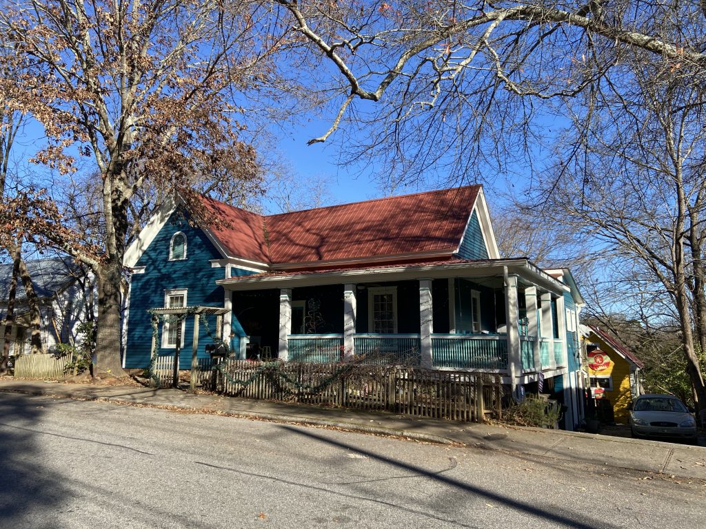
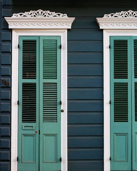
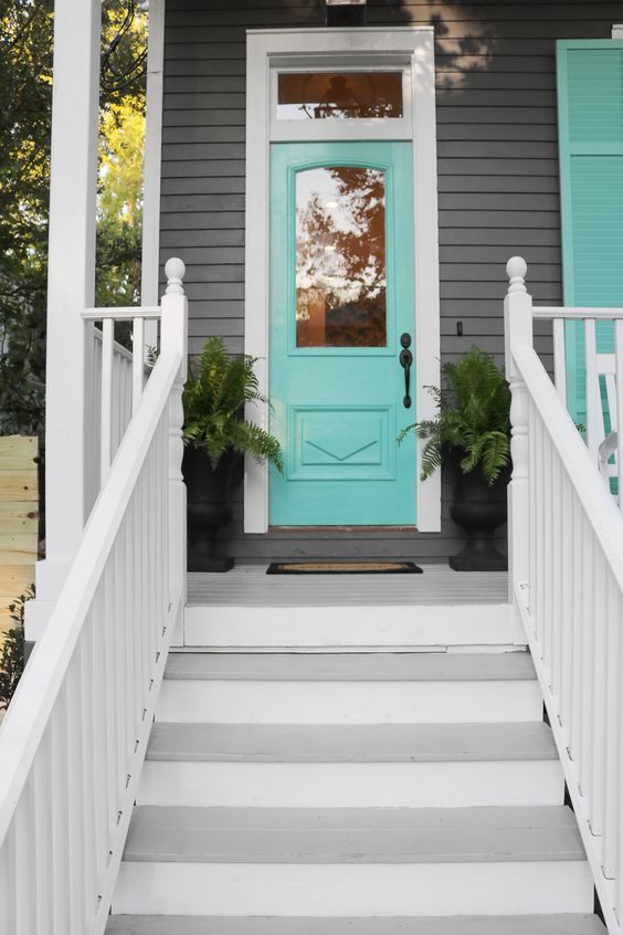
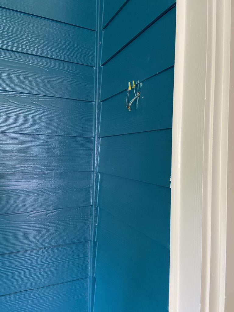
I’ve also been obsessed with dark houses—not dark in a spooky way, but in dark, dramatic palettes that make a statement as you walk by. I knew I didn’t want a butter-yellow or pale peach house; I wanted something that would make a statement. After scrolling through Pinterest for weeks (or maybe it was months? Here’s where the pandemic-induced time traveling began to set in), I settled upon an inspiration image from New Orleans of a cool dark blue wall and teal shutter—I knew I wanted a front door that popped and I liked this effect.
From there, I scoured Benjamin Moore’s color samples looking for the right pop of accent colors that complemented the color family without being overwhelming, or popped where they needed to. Luckily you can order swatches printed on cardstock that you can move around to different places and catch the light at different times of the day.
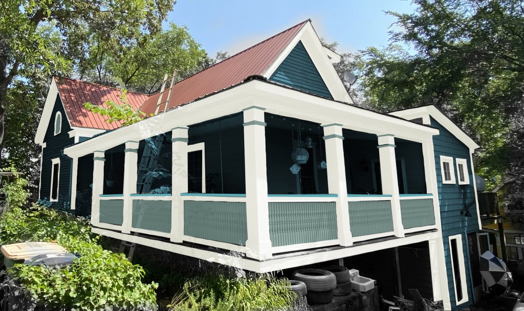
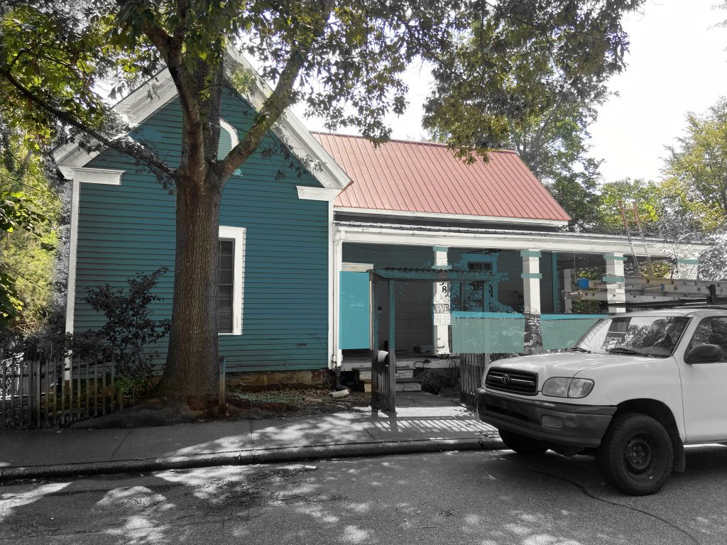
With something like 20 color samples between the body, trim, accents and more, Here’s what I settled on. I even made up a Photoshopped sample to get a better idea of how all the colors would come together. It ended up being a handy guide for the painter, too!

It’s go time
OK, with my Pinterest board fully fleshed out and feeling confident about my choices (I had was I thought was a solid backstory, reason, and research to justify it all!), it was time to get the party started.
Pro tip: If you’re in a global pandemic and lucky enough to work from home, try not to engage in home projects during the workweek. On several occasions, I had to repeat myself on a Zoom meeting while the tablesaw churned nearby (my “office” was the living room and the makeshift wood shop was on the porch just on the other side of the wall). But once the painting started, it was a pretty quick and painless process. The crew descended on your house early in the morning and, by around 3 or 4, they’re wrapping it up for the day. within a few days, they were pretty much done—even with a day of rain, leaving four guys to work around each other while they worked on the front porch (they only place they could go in the rain—but hey, they made it work).
I kept telling people that I never thought I’d get so excited about house paint. But, well, here I was, getting excited about it.
In the end, my lesson here is to make a big decision like house color armed with research and reasoning. I would be very skeptical of someone who decided to paint their house a color they “just fell in love with.” I mean, you should love the color you are painting your house—maybe? I’d argue it’s different than choosing an interior color, where you’ll be staring at it every day you live in that house (not to mention, painting an interior room is infinitely easier than changing the exterior color). No, I’d say the exterior of the house has two goals: To reflect the house within its larger neighborhood, and to set a tone for what people should expect when coming inside. If you choose a coral or a sea foam or a sunny yellow for the sole reason that you find it enlightening, I think you’ll be disappointed.
Instead, do your research. Find lots of examples. Drive through neighborhoods and look for colors you like—then ask yourself why you like them. Also, find houses in the same style as yours and see how they are painted—this can help you avoid some clashes of styles and color schemes.
All told, I think I planned, saved and schemed for about two years before any paint touched the side of the house. But it’s not a project that should happen overnight, and having spent the time to plan it out, I can now say it’s a pandemic project we’re proud of.